Inclusive Design
六月 08, 2017
It’s your job
My job is to make things easy for people to use, this includes anybody, in any possible situation. From design through to development we should be thinking about inclusivity. We want as many people to use our product as possible, right?
A common trap that designers fall into is designing for themselves. It’s easy to design for your 27" screen, with beautiful hover effects and transitions on every click. But we are not our users, and there’s no way of knowing exactly how somebody is going to use our product. By following accessibility principles, we will go some way to ensure that all our users can use the thing we’re designing. In fact, by designing for inclusion we will improve the experience for everybody.
If we use our own abilities as a baseline, we make things that are easy for some people to use, but difficult for everyone else. — Microsoft inclusive toolkit
Before I worked on a GOV.UK service I’d only ever worked on private sector projects. The private sector has for a long time been focused on getting perceived business value over user benefit. I recall a client once saying “forget doing accessibility work if it means it’ll cost that much”. It makes me shudder thinking back to this, and how naive I was to think that was OK.
“We don’t have any disabled users” was the reason given. I’ve heard that a few times now, and it’s so short-sighted to think that. I haven’t called this post Accessibility tips and tricks, as I don’t want it to be thrown into this bucket. It’s important that we get beyond the mindset that ticking WCAG checkboxes is job-done.
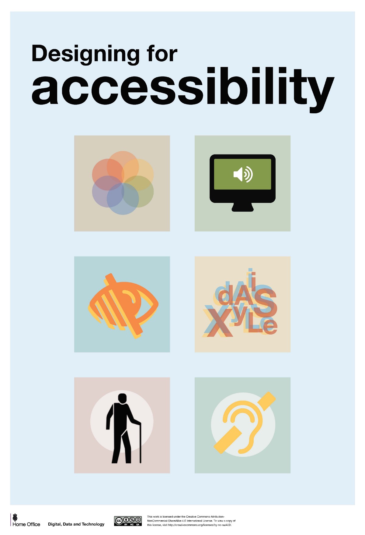
Working on GOV.UK services, having access to all the talented designers and developers there is inspiring. There’s also the disability network with people like Chris Moore and James Buller that are always ready to help. At the beginning of 2016 I met Karwai Pun (Home Office) at a meetup and was inspired by the posters her team had created.
These posters are well designed and get the point across to people unfamiliar with accessibility. They’re also perfect for plastering over the walls of your project as a constant reminder. You can download the accessibility posters here.
Why should I care?
There are over 11 million disabled people in the UK, which is enough of a reason on its own. 83% of disabilities are acquired through work, so there’s a chance you could have a permanent disability one day. How would you use a product you’re designing if you could only use the keyboard to navigate?
It’s not only the users with a permanent disability that will enjoy your accessible service. In fact 60% of people without disabilities use some kind of accessibility feature. If you’re reading this there’s a good chance you’ve used one without even realising it.
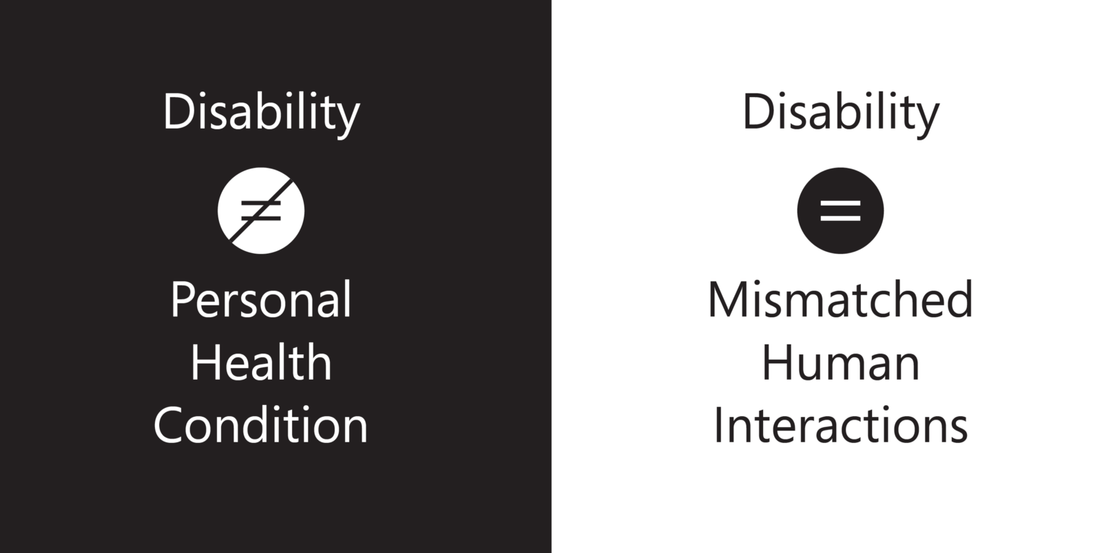
If you design with a disabled person in mind, you’ll create a better product for everybody to use. Here’s a few products designed for disabilities that you may not be aware of…
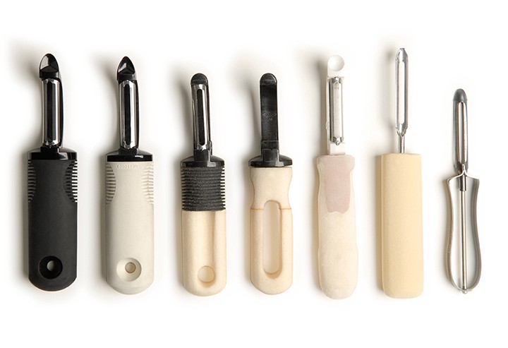
Designed for a chef’s wife that had arthritis, the OXO potato peeler is now one of the most popular kitchen utensils. It’s more comfortable for everybody to use.
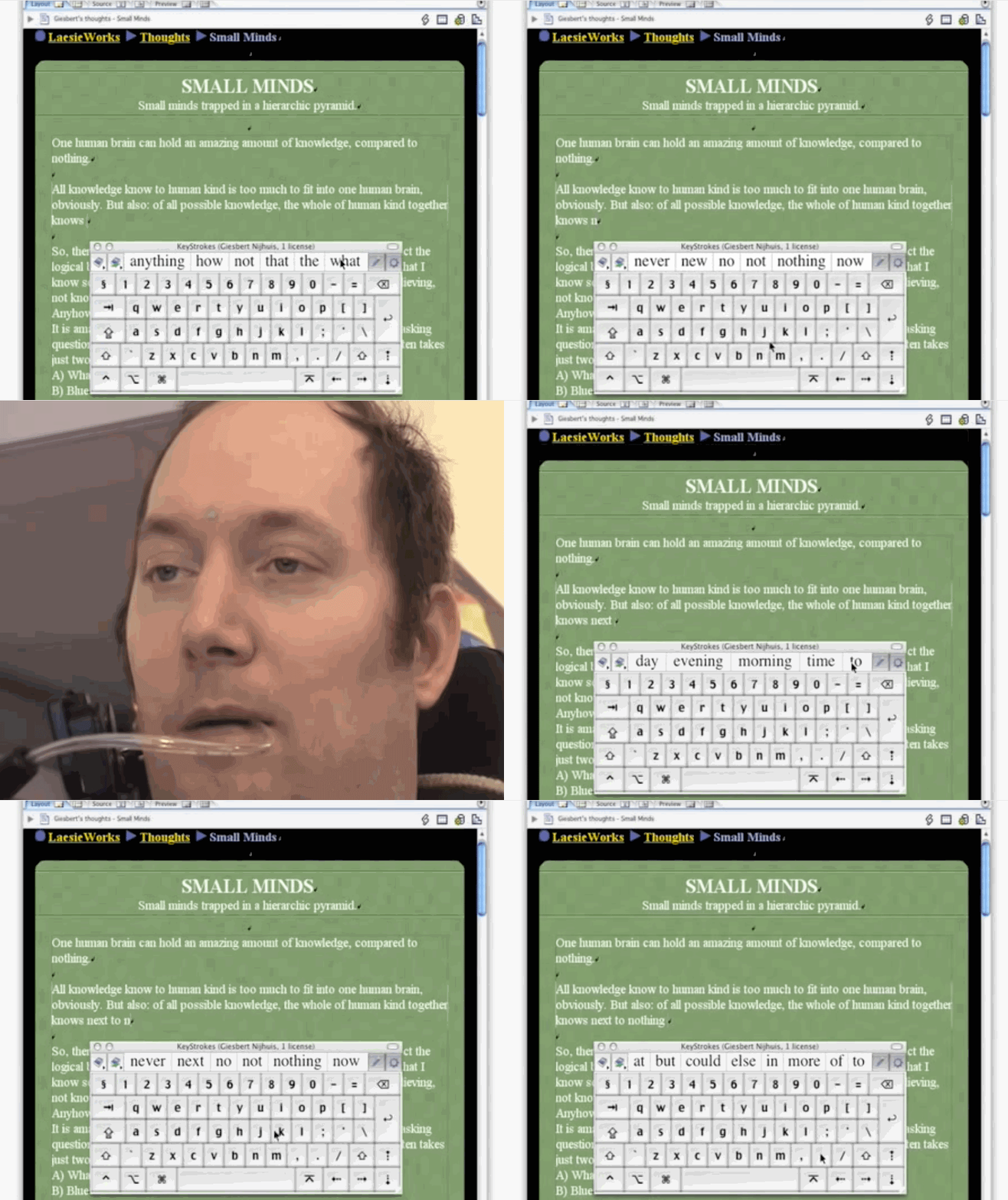
Predictive text was designed for users with motor problems to easily type their message. It’s difficult to imagine using your smartphone now without having access to the predictive suggestions. In fact, SMS messaging was designed for deaf users to begin with!
Not all disabilities are permanent
Have you ever been on your commute and watched a video on Facebook or Twitter? More and more organisations are adding captions to their videos, great for the commute and great for the hard of hearing. Imagine you’re surfing the web with a beer in one hand, or what if you’ve broken your wrist? Filling in a form without being able to tab between fields would be incredibly frustrating.
These are “temporary or situational disabilities”, Microsoft’s inclusive toolkit illustrates this well.
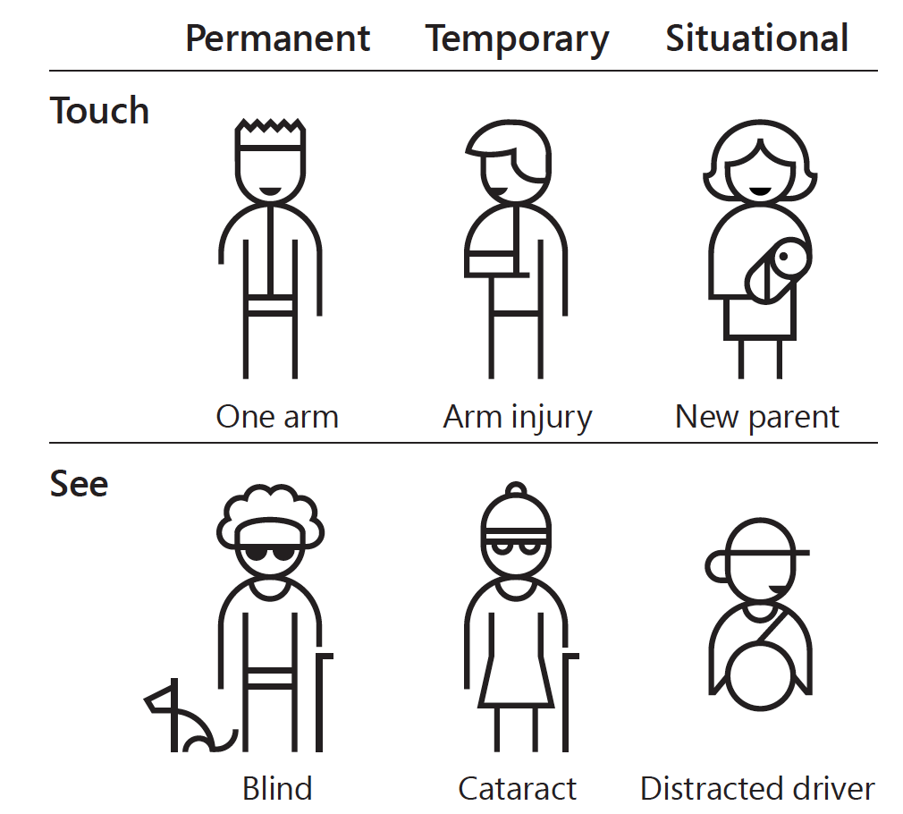
If we think of disabilities as permanent then we’re talking about small numbers, in the US around 26,000 people a year suffer loss of an upper limb. But if we include temporary and situational disabilities then the number is more like 20 million. So we go from benefitting less than 0.01% of users to around 7% of users.
It shouldn’t be ugly
In fact it’s usually the opposite, making things simpler and cleaner leads to a more pleasant design. If you start with getting all the basics right, then you can be as creative as you like. The main thing to remember is that the web was originally built to deliver content, and for the vast majority of websites this is still true. Avoid as many obstacles to an easy reading experience as possible.
I’m not going to repeat all the points in the posters I mentioned earlier, but here are a few pointers and tools to help you.
Write in plain English
“Content is king” as the saying goes, so ensure your content is easily readable by using something like the Hemingway app.
Use good colour contrast
Aim for 4.5:1, this helps people to read your content. You can use a tool to check this by putting in a foreground and background colour. Snook’s tool does a good job of this. You can also use a browser extension like the tota11y extension by KHANACADEMY.
Describe all images and videos with alternative text
Most web services allow you to add alternative text when you upload any kind of media. If you’re building a website then make sure you include some descriptive, alternative text using the alt attribute.
Build for keyboard-only use
Use proper, semantic elements when you’re writing HTML. If it’s a button then use a <button>, don’t use a link instead. This will ensure users can navigate your site without using a pointing device.
Make large, clickable areas
Not only does this help users with impaired vision or movement, it also helps users on touchscreen devices.
Follow a logical, linear layout
Focus your most important content in one column, avoid splitting things over columns if possible. Users with visual impairments often zoom their screens into a column, so this will avoid them missing anything.
Test with actual users
Probably the most important point. You can only do so much by using automated tools so make sure you test with as many different users as possible.
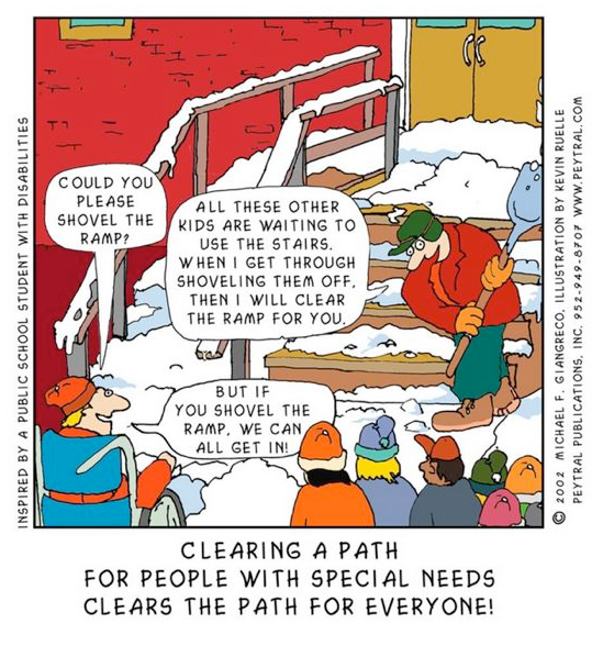
You can watch me talking through some of this in more detail in my brown bag at Valtech UK.


