november 18, 2019
In the middle of September four designers from Valtech travelled to Utrecht for a two-day conference focusing on all aspects of working with design systems.
So what is a design system? Mainly it is a tool that helps you maintain consistency in your design, but it also makes it possible to design faster and communicate better with the rest of the team. For example a well-structured and working design system can have a UI-component library for designers, coded components ready to use for developers and UX principles that are described and documented.
To be successful a design system should always be part of our process. We should start small and then successively scale it up, having a small-medium-large approach. Coded components fits into the large segment in the scale of a design system, but does not necessarily need to be the best solution for all project. On the conference we talked about when a design system should be implemented in a project, the importance of consistency and how a team can create and work with a design system together. Some of these things will be discussed in this article.

The conference
The conference was an internal meeting where all Valtech-countries were invited, it took place both in Europe and America at the same time and made it possible for us to share knowledge.
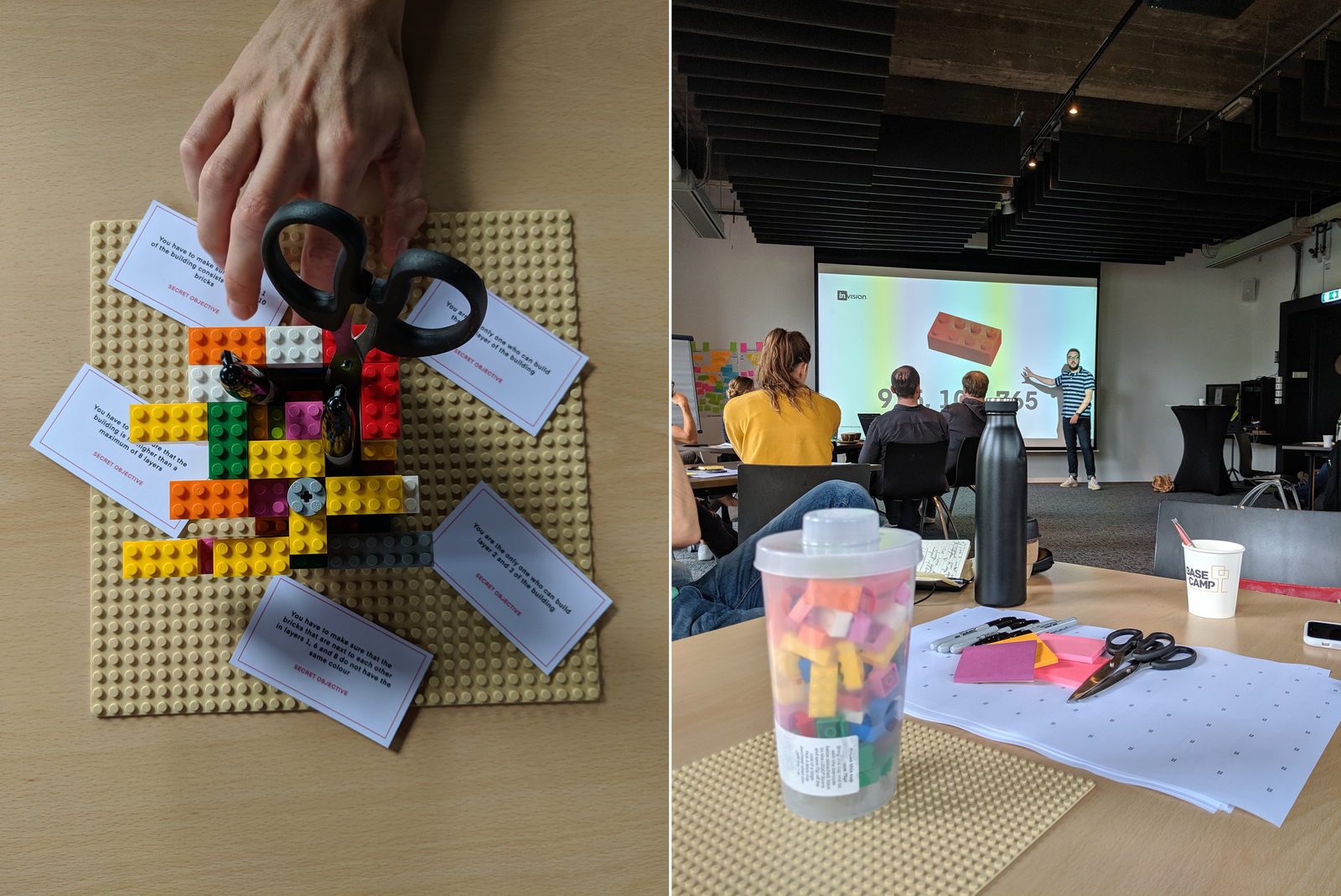
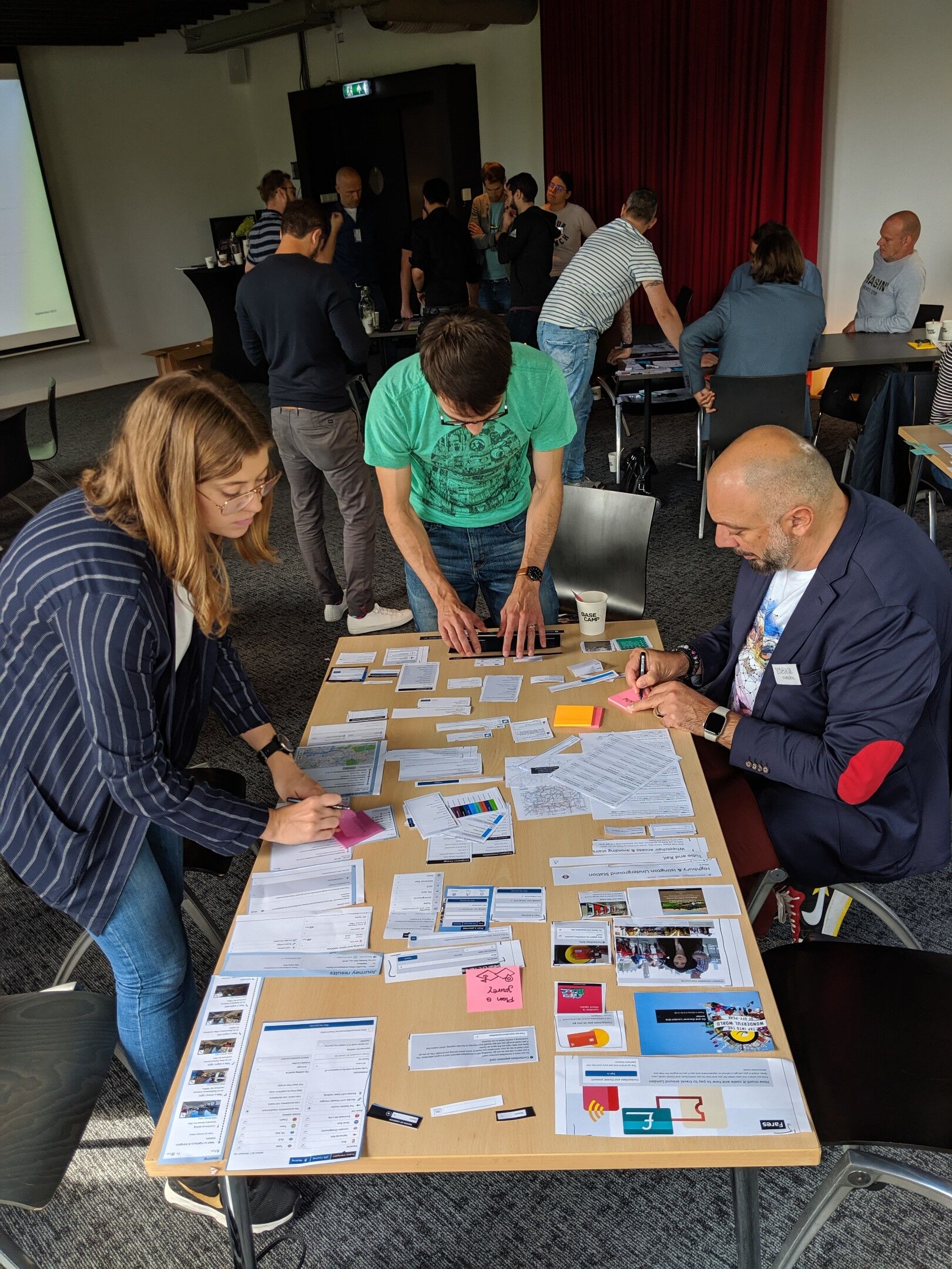
On the first day we had several workshop sessions where we tried to answer the main question, what are the challenges when working with a design system? One was from Valtech’s Service Design Toolbox, “Define the Challenge”. On a big board we individually and in a group answered questions about the use of design systems through the following areas; possibilities, constraints, risks and similar experience. The goal with the workshop was to align the group and create a shared and common understanding of the challenge. During the second day InVision was invited to talk about design systems. We had a workshop with them focusing on how to create a shared design language and they gave us practical tips on establishing a design system within your organisation. This is what we came up with and some general thoughts about working with a design system.
When to start with a design system
Start early
We talked about start building a design system as early as possible – making it visible, improving it by start using it – while keeping in mind that we still need the creative exploration phase in our projects to challenge the project outcomes. The earlier we start, the more time for creativity with “the content” and “the story” we get. It is also a way to getting new people on track faster.
Team on track
A design system should be easy to use, but at the same time describe the design components and UX patterns in a way that the designer and developer understand the bigger picture. The parts can be collected in a component-based library, but we want to emphasise that it is more than just visual guidelines. All in all it is the parts that together create the digital identity of a brand, i.e. who you are online.
How to start building a design system
First identify what you need and evaluate what is common between your current project and previous solutions. Is there any existing material that you can work with when building up your design system? Is something already designed? If so try to reuse it, but only build what the user needs. Start out small by setting up Sketch in a reusable way (library, symbols etc). Also try to vary your layouts by tweaking variables, rather than creating multiple, similar components. Use your time and budget on unique and creative features instead.
Do you need help with creating a design system? Valtech can help you, contact us.

How to manage the expectations of a design system
The size of a design system
Before or during the process of building a design system we should create a plan for the ambition of our design system. We discussed creating a roadmap with goals for specific project divided into now, next, later and future for the design system. A small goal could be to increase the UI-component usability and a future goal to have a design system site with coded components. When creating a roadmap for our design system we can start small and then successively scale it up.
Maintaining
In order to create a working design system that lives over time we also need to include the cost for maintaining the design system. It helps to have a design system owner, who makes sure that this is part of our way of working and continues to be top of mind of the whole team. The design system should also be open for everyone to see and explore.
Rules and creativity
Treat it as a product
The design system should be treated as a product, so it is important to define the process of updating the system. Select a few persons with different skills who are responsible for updating and maintaining the design system. Use versioning with Abstract or similar to keep everybody in the loop and avoid unnecessary work. Let the design system owner be the person who is responsible, for example by adding notification in Abstract when a new component is added.
The importance of consistency
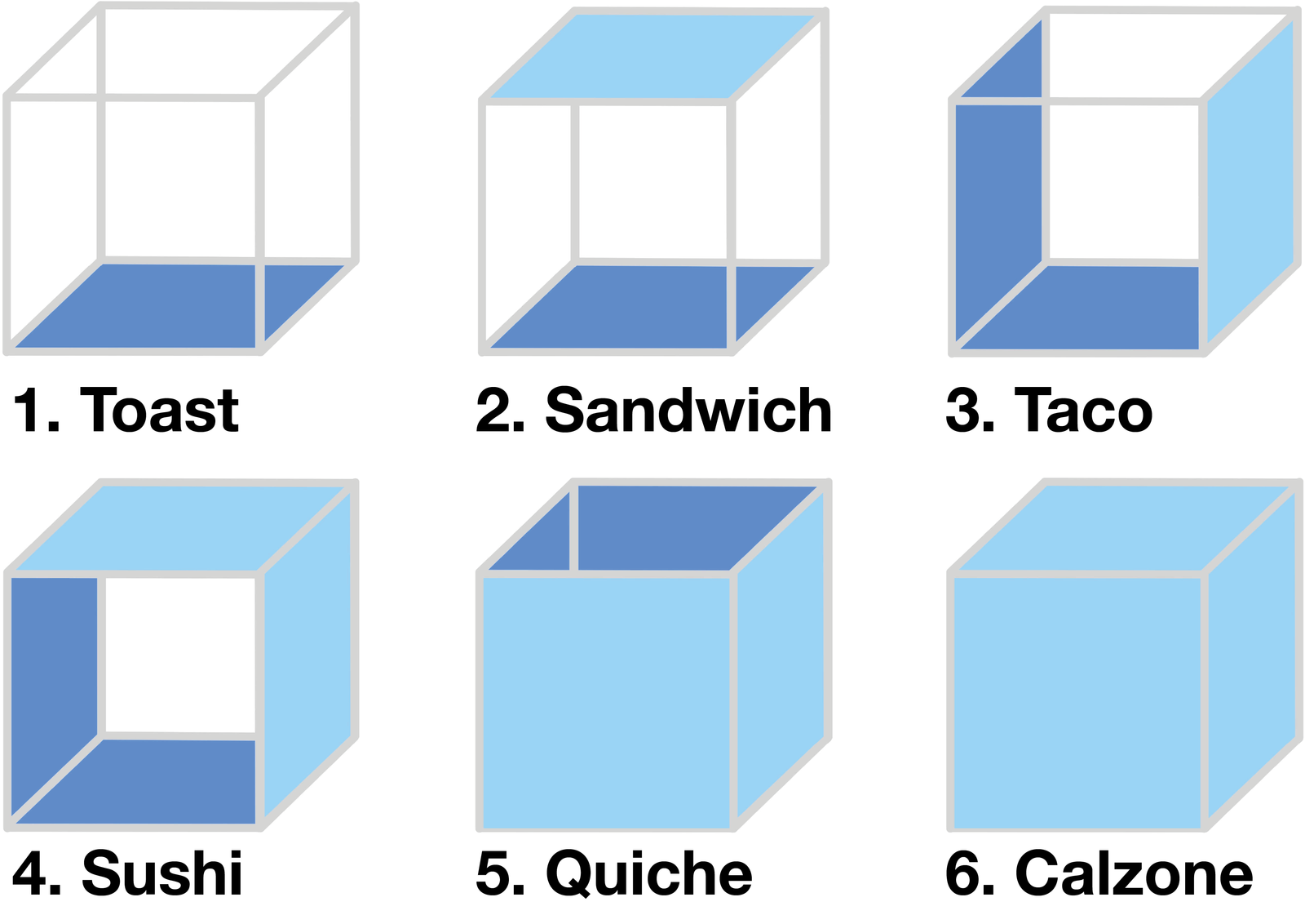
Consistency is the key to success when building a design system. The team should agree on a shared common language for components and symbols. For example a component can be looked at differently from one person to another. If you look at the cubes below, can you identify any other food in each one of the cubes, more then just a toast for example?

So, did you see anything else except a toast and a sushi? Maybe you also saw a pizza on number one and a hotdog on number three. This picture shows the importance of consistency when structuring components. The important part is to align the team members and work consistently when building a design system.
Defining the concept
Let the design system define the overall design concept. Show the visual expression by defining brand images, colours, typography, iconography and illustrations. Extend the guidelines to include interaction patterns and micro animations such as hovers, expansion panels and other form of transitions. Also think about the needs of accessibility and multi-language websites and how that affect the design in terms of colours (contrast) and typography (text direction, typeface etc).

Conclusion
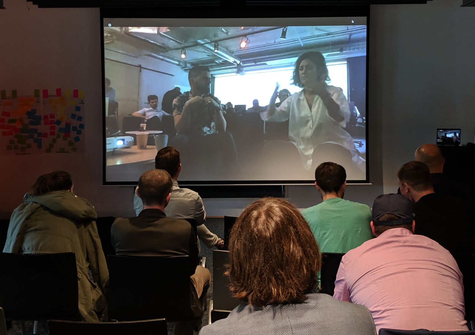
At the end of the conference we called the corresponding group in Montreal to compare our results. It was fun to see that we more or less had the same outcomes and thoughts on how we can work with design systems in the future.
All in all it was two very interesting days where we got to deepen our knowledge about design systems together with colleagues and experts within the field. The extended time aspect – two full days – also made it possible to go beyond the basics, which made a big difference in terms of how far we got in our discussions.
Lastly, working with a design system is very much a mindset. It is a way of working where you start to think about the importance of consistency in your design and how that affects your product and your performance as a team. Maybe you don’t see the need of full-scale design system right away, but we recommend that you give it a try. Start out small using symbols in Sketch and then successively scale it up to a more sophisticated, module-based design approach. Hopefully this will result in more consistent design and efficient teams. In the long run this also means better products.


