Neem contact op

USDA

Agile UX design in agriculture

How we developed an enterprise web app for the U.S. Department of Agriculture

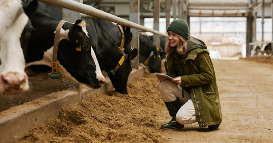
In a barn, a farmer kneels before cows, holding a tablet. She smiles at a cow.

Industry

  • Agriculture

Offering

  • Experience Elevation

Rapid agile UX process

USDA

Farmers and ranchers who voluntarily follow conservation practices can be awarded subsidies by the U.S. Department of Agriculture (USDA), a process typically heavy on the administrative side and full of complexities.

In an effort to reduce time and waste in granting these subsidies, the USDA brought us on board to lead a rapid agile UX design process that resulted in a beautiful enterprise web.

Working together with agriculture professionals and the USDA, we delivered an effective user interface for farmers, ranchers and regulators, and uncovered even more insights than they originally expected.
2,500 regulatory and functional requirements

USDA

The USDA’s conservation branch spent the vast majority of its time behind the desk drowning in paperwork. They not only needed to streamline the process of granting subsidies, but also to get back out in the field, where their time was better spent.

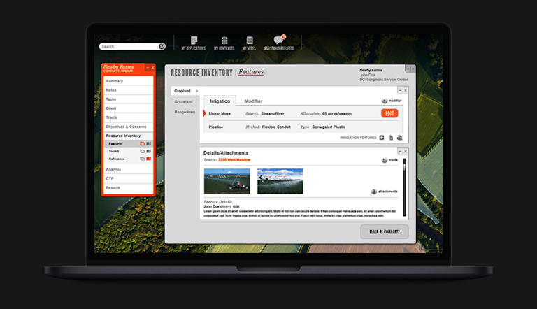
They needed a powerful enterprise application that could log the various criteria required for the subsidies, and specifically address the challenge of plotting latitude and longitude coordinates for land units, which fell on the shoulders of farmers and ranchers to discover and record.

Additionally, the application had to accommodate more than 2,500 regulatory and functional requirements while being extremely intuitive.

A mockup of a laptop with the interface of the web app for the U.S. Department of Agriculture, showing features to  plot and save land coordinates.

User research in the field

USDA

The application began first and foremost as a user experience design project.

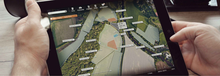
We sought to become subject matter experts and sent their user research team into the field, where they discovered that farmers and ranchers did much of their work using maps spread over the hoods of their trucks.

A light dawned. We recommended using maps in the new interface—a suggestion that was well-received and soon became the focal point of the new application, breaking all the design patterns everyone had initially assumed.

We also acted as consultant and agile coach to a team of 321 USDA developers, organizing cross-functional teams of designers, end users, system architects and engineers to balance the users’ needs with the challenges of enterprise application development.

Hands holding a tablet with the interface of the web app for the U.S. Department of Agriculture, showing an aerial picture, where land is divided into different sections.

Custom government application

USDA

The USDA’s custom application now gives agriculture professionals the right kind of tools to plot and save their land coordinates — making that part of the subsidy process much more user-friendly and familiar.

At a high level, the USDA achieved its goal when we were able to distill the needs and information from a large number of stakeholders into an easy-to-use solution that met all 2,500 business requirements for the federal regulators and conservationists using it everyday.

Neem contact op

Let's reinvent the future