Neem contact op

Tesco Now

The power of retail innovation

Developing a new mobile shopping experience for busy Londoners

Blue promotional graphic for Tesco Now, featuring the text 'Get up to 20 items delivered within 60 minutes' with a 'Place order' button below, encouraging users to quickly order groceries for fast delivery.

Industry

  • Detailhandel & Goederen

Offering

  • Commerce Acceleration

An innovative moblie shopping experience 

Tesco

For consumers in London, convenience and immediacy at the tap of a finger are the norm. When it comes to buying our groceries, customer expectations keep rising.

As the third largest retailer in the world, and an iconic global brand, Tesco is the go-to grocery destination for millions of shoppers. In the face of new competitive entrants, Tesco needed to introduce a new mobile shopping experience in response to growing demand for increased convenience.

With a clear vision in place, Tesco appointed us as their expert mobile partner to refine their proposition and accelerate the delivery of a brand new mobile service, Tesco Now.

Tesco Now is a market-leading grocery service with no minimum order, getting everyday essentials to Londoners quickly, and on-demand.

Retail innovation shaped by customer demand

Tesco

Tesco had already conducted a number of small-scale experiments to collect shopper data. This provided important early insight into the customer desire for an on-demand mobile grocery service, and allowed the team to kick-off with an initial discovery phase supported by our strategy team.

Discovery successfully validated and refined both the service and product proposition. Thorough research, focused workshops and in-depth interviews with a core group of Tesco customers allowed the joint team to clarify their awareness of:

  • What customers expect from an on-demand service

  • What customers want to achieve from an on-demand service

  • When and where customers want to make orders

Using our outcome-driven framework throughout discovery allowed the team to move quickly, establishing a clear set of service priorities for the app. These would become essential in empowering the joint team to make leaner, faster decisions and, in turn, accelerate delivery.

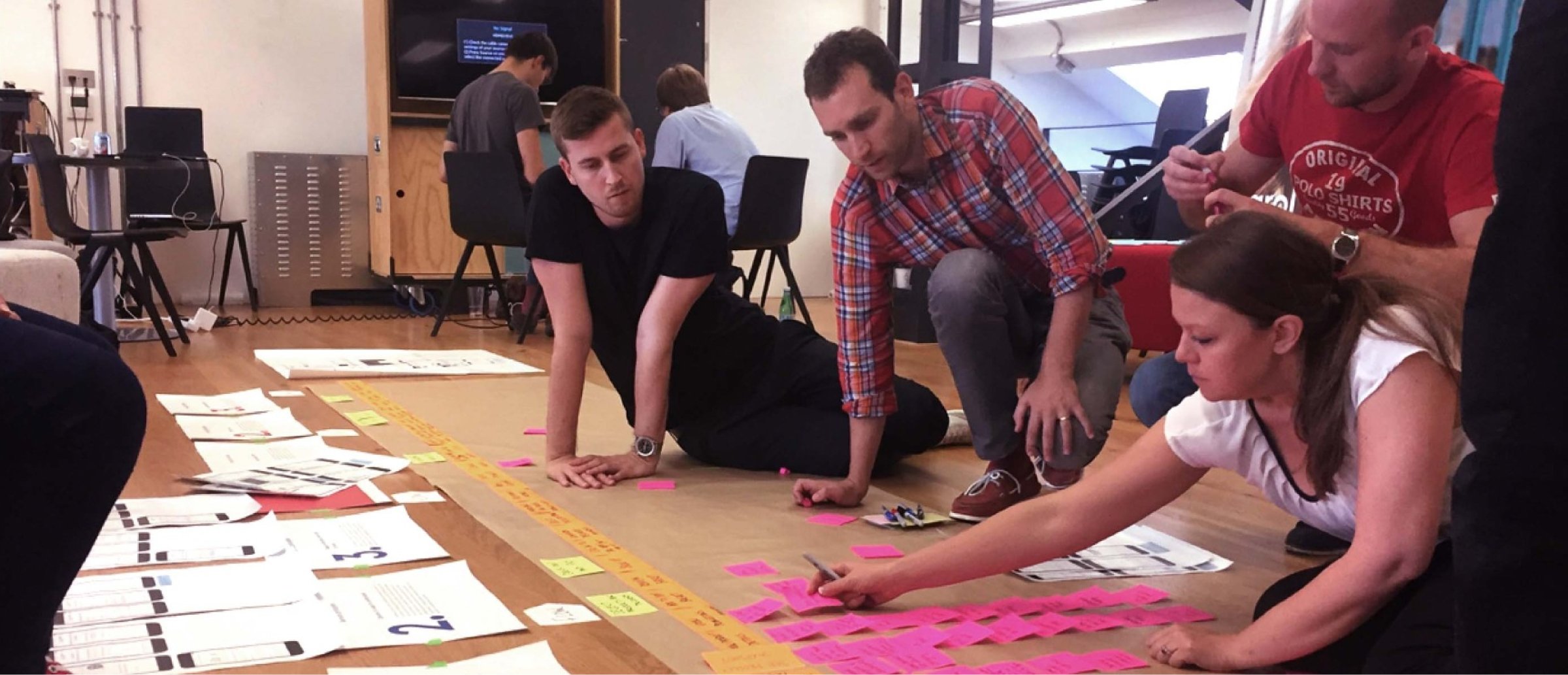
  • A group of people collaborating during a workshop, sitting on the floor and organizing notes on large sheets of paper. One person is writing on pink sticky notes, while others are reviewing documents spread out on the floor. The setting emphasizes teamwork and creative brainstorming
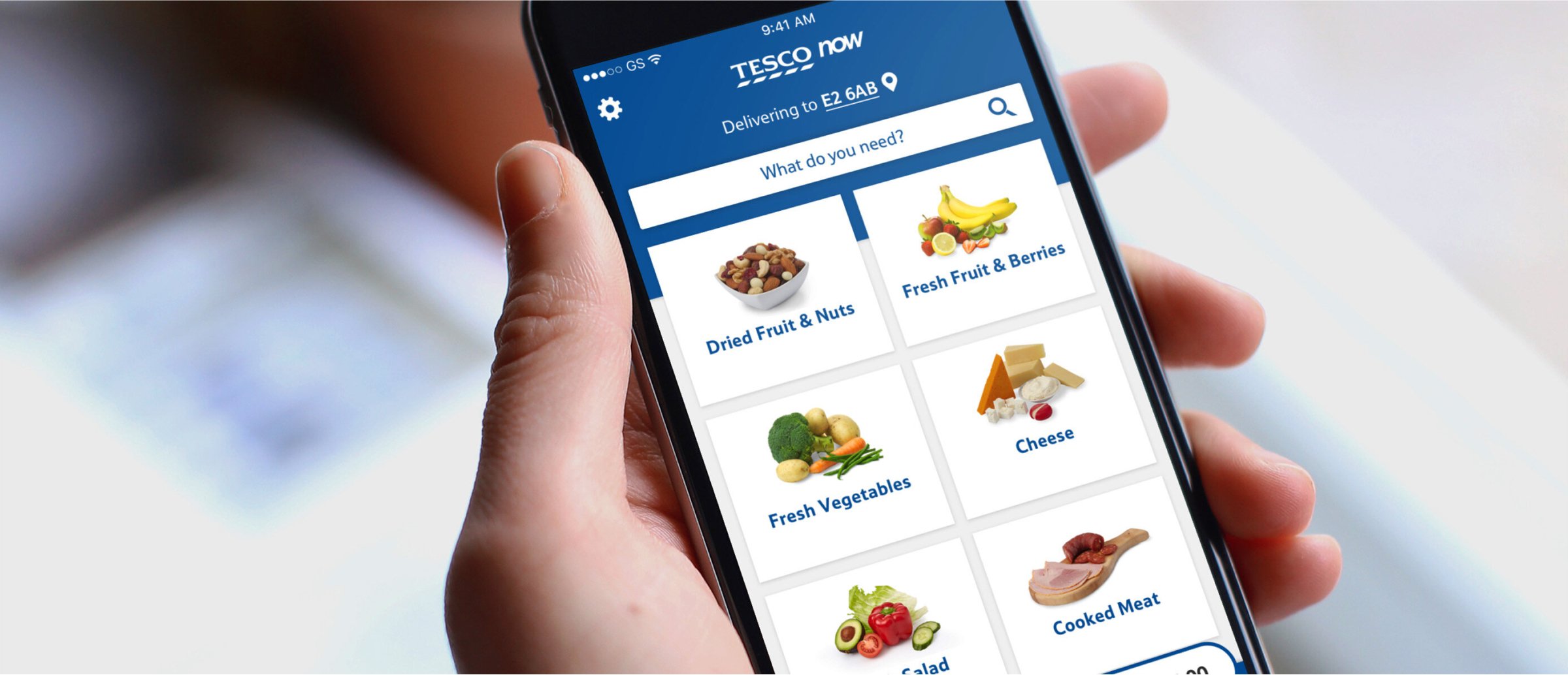
  • A person holding a smartphone displaying the Tesco Now app. The app screen shows various grocery categories such as dried fruit & nuts, fresh vegetables, cheese, and cooked meat, with an easy-to-use interface for selecting items to order for delivery.
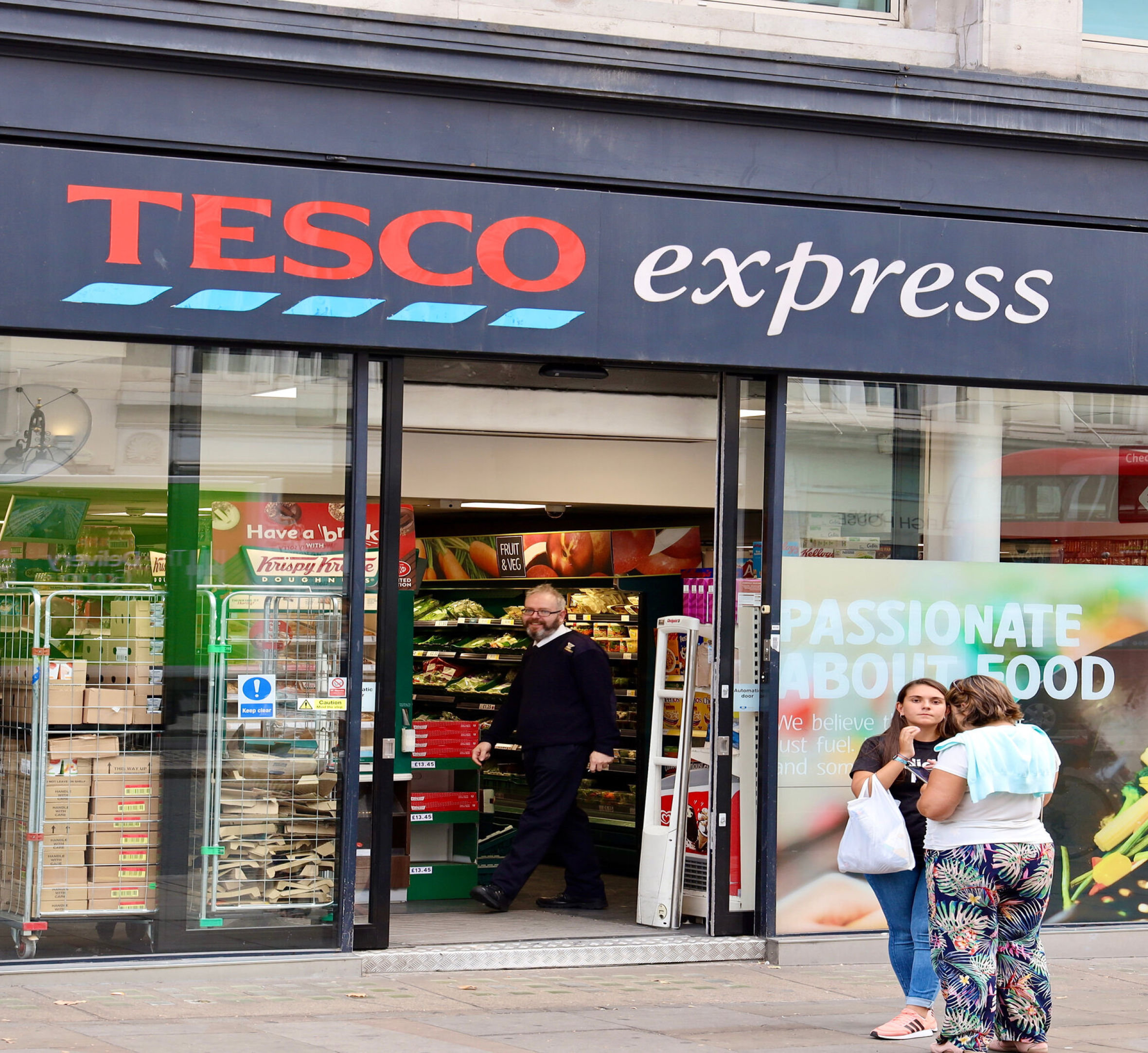
  • A Tesco Express storefront with a glass entrance, showing a man walking out of the store and two women standing outside, one holding a shopping bag. The store's interior displays fresh produce and other grocery items, and a large sign promoting the brand's passion for food is visible on the right.
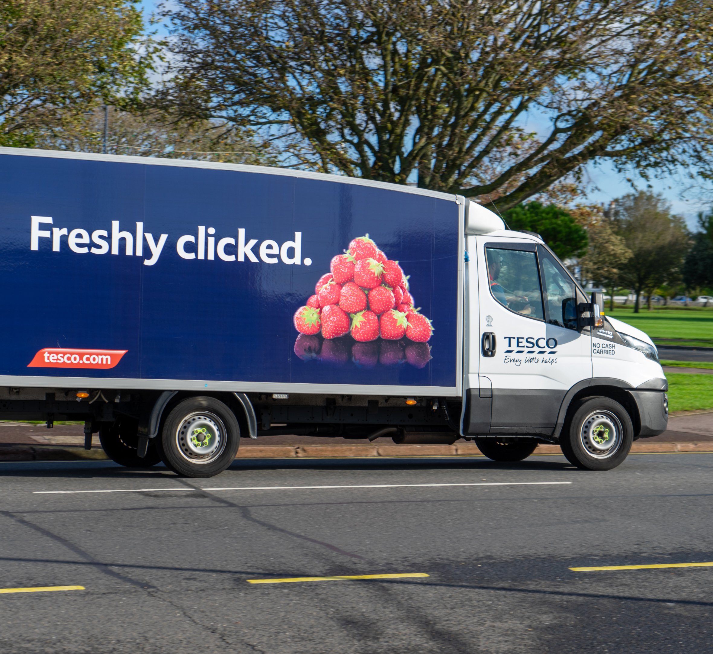
  •  "A Tesco delivery truck driving on a road, featuring an advertisement on the side that reads 'Freshly clicked' with an image of fresh strawberries. The truck promotes Tesco's online grocery service, with a logo and the website 'tesco.com' displayed on the side.

Consistency anytime, everywhere

Tesco

With such a strong, resonant brand as Tesco, it was essential that the new app behave and feel like an integrated channel.

Creating this seamless shopper experience across in-store, online and mobile was made easier thanks to Tesco’s clear design principles. Our designers were able to quickly develop a sleek user interface that maintained the familiar Tesco brand experience on mobile.

Streamlined scheduling

Tesco

In parallel to the app’s development, Tesco also created a sophisticated middleware layer, which supports Tesco Now by optimizing data for fast, efficient delivery to mobile.

This was a prerequisite for a fast, modern and intuitive mobile experience that also allowed Tesco Now to integrate with Tesco’s core back-end systems.

Running two such important projects in parallel meant communication and scheduling were mission-critical for the joint team. Both companies worked closely, side-by-side, to build their respective components based on a modular architecture.

This architectural approach delivered acute flexibility, ensuring Tesco Now has room to grow and evolve as the service develops. It also maximizes the opportunity for code reuse and means the product can be efficiently maintained in the future.

Five smartphones displaying various screens from the Tesco Now app. The screens show different stages of the delivery process, including entering a postcode for delivery, selecting items like fresh vegetables and drinks, and checking out with delivery in 60 minutes. The app features user-friendly options for managing orders and payments

Automated, journey-driven testing

Tesco

Working alongside Tesco's experts at the company’s dedicated testing lab, our test engineers conducted extensive usability and exploratory testing.

Automation proved to be key. For this, we took an innovative, journey-driven approach, automating the core end-to-end journeys that customers make through the app. From this, we created a fast, highly efficient automation suite that gave us feedback at pace.

A decisive factor in the project's success to date has been the focus and dedication shared across both companies. Co-locating and co-sourcing the team facilitated strongly collaborative and agile ways of working, allowing team members to stay in sync and pivot at speed when confronted by unforeseen challenges.

Three customer reviews for the Tesco app, all praising its accessibility and ease of use. The first review mentions voice-over compatibility for blind users, the second highlights improvements for navigation and user experience for blind users, and the third describes the app as a 'lifesaver' for someone recovering from major surgery.

Neem contact op

Let's reinvent the future