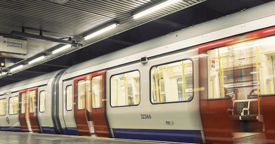
With 1.34 billion passengers a year, the Tube Is an intrinsic part of London life. Any disruptions, however small, to this essential service can cause a ripple effect that is felt not just on the network, but across the city itself.
Examples of this can be seen in surprising places. Take brake testing. Each time a Tube train is suspected of faulty brakes, it is removed from service to be tested. This is because, in order to see if brakes are working as intended, the existing testing technology required the train to be brought to a complete stop. The Underground’s tight schedule means if the train were left in service during this process, severe delays would occur across the line.
But what if the train’s brakes turn out to be working just fine?
Removing a train from service has still proved disruptive to passengers, and incurred costs for TfL. In one year we analyzed, over a quarter of Tube trains removed for testing on just three Underground lines were actually found to be fault-free. Scale this up across all lines, and the impact to both engineering time and lost passenger hours becomes a sizeable problem.
