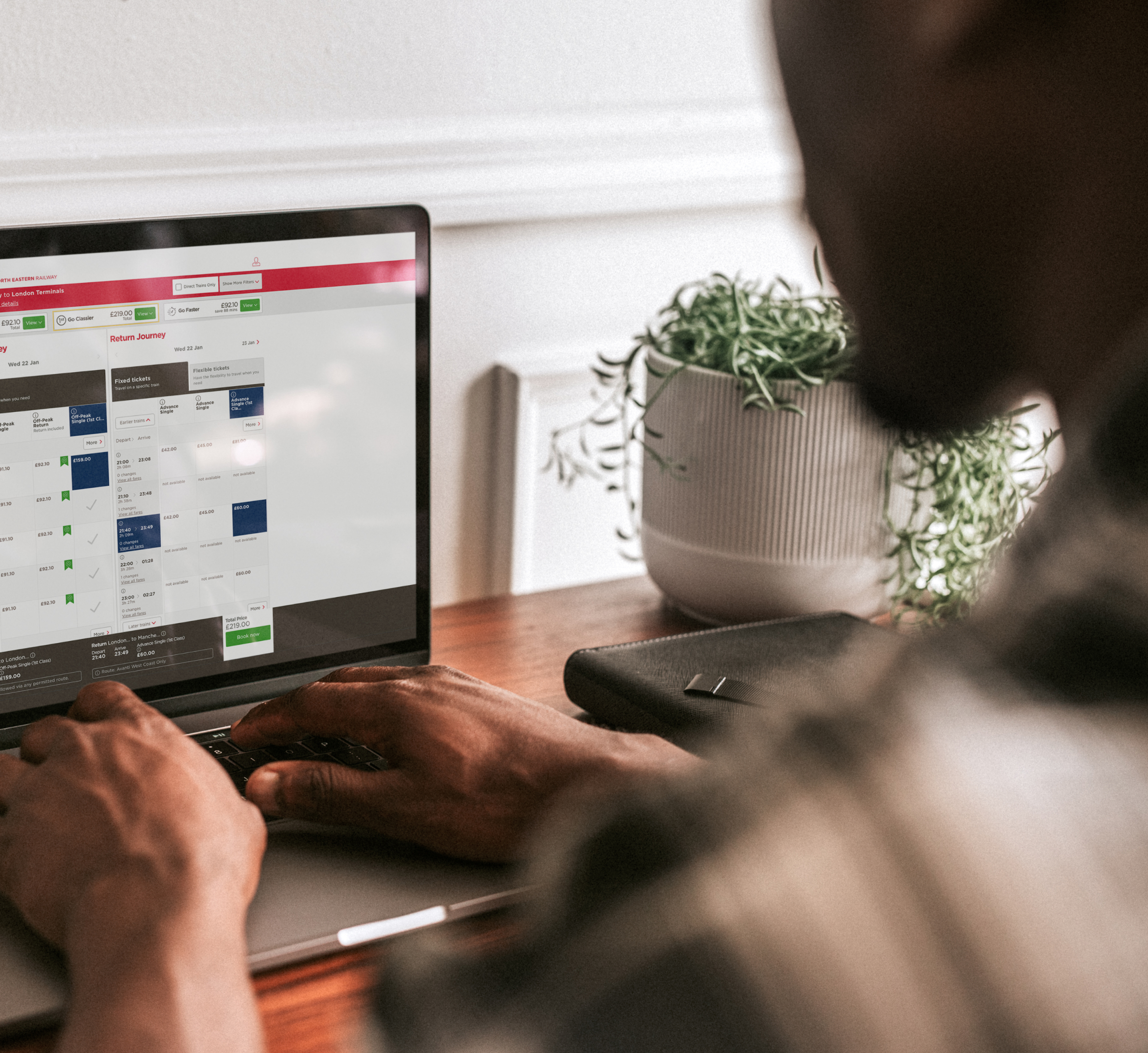
The old ticket-booking tool promoted more expensive tickets. We wondered why we shouldn’t show cheaper fixed-price tickets first. Nobody else was doing it for some reason.
This meant travellers could compare ticket options and prices, then easily see whether a ticket was fixed or flexible. If they chose a more expensive combination than they needed, the system told them.
All digital clutter was removed with a filter that allowed customers to quickly view the cheapest fares or journey. They could also see when their ticket was valid, a personalized price breakdown of their booking and where they’d made savings.
To better serve travellers on-the-go — the majority of visitors to the site — we created a rich mobile experience based on analytics and user data, including the addition of PayPal.
Simple and fun
Improvements were designed to drive engagement and enhance the customer experience.
We did everything we could to make the interface simple and transparent. At the same time we didn’t forget the fun, down-to-earth tone of voice.
As part of the process, we got insights from user testing and an eight-week beta period to feed into further rounds of optimization.
The new site was built using the Optimizely platform. This industry-leading solution also involved integration with multiple third parties, such as CBE booking engine, IBM Interact, CyberSource and National Rail Enquiry.
Late and hungry
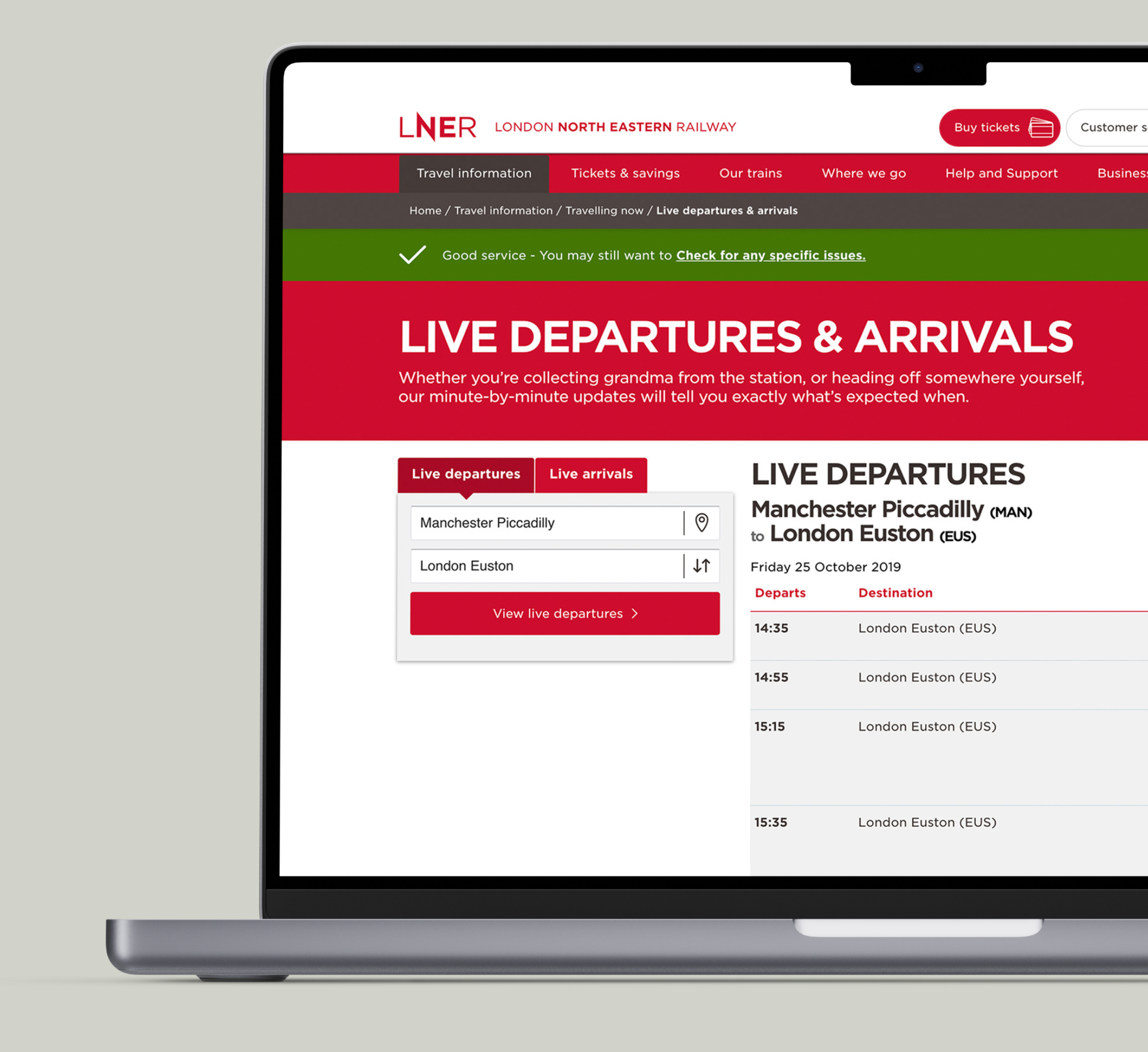
We made it possible for last-minute passengers who normally wait in line at a kiosk to purchase their ticket online within 15 minutes of their train departing.
Passengers could also pre-order food ahead of travel, and enjoy it being delivered straight to their seat. The cheese ploughman sandwich was a firm favorite with passengers, closely followed by tuna mayo.
Making it accessible
We created a separate, accessible booking flow optimized specifically for customers using assistive technologies.
Partnering with the Royal National Institute of Blind People (RNIB) for the site’s accessibility, we achieved the RNIB’s AA Tried and Tested certification. This meant there were no major accessibility or usability issues that could prevent a blind or partially sighted customer from using the site.


