For such a transformational project, the right team needs to come together with a shared vision and passion for success.
A blended team
Meeting this challenge head on were a blended TVG and Valtech team, designed to include all of the core skills and experience required to create a design system that met TVG’s needs, including designers, developers, QA testers, delivery and product leads.
The potent formula of Valtech’s extensive design system, accessibility and content know-how, plus TVG’s years of technical, business and customer understanding, and a willingness to collaborate and passion to succeed from both sides, provided the team with everything they needed to attack the problem at pace.
Valtech’s design system UI specialists leveraged Figma’s capabilities to ensure componentry was responsive, accessible and reusable. They also helped to upskill TVG designers in the new tooling.
Experienced engineers and QAs from TVG worked closely with the Valtech designers to ensure components were built and tested to the high standards set by the squad.
Accessibility was championed across the team, but not least by Valtech’s Accessibility Lead, Annick, whose invaluable accessibility experience and developer background ensured her guidance was pragmatic and actionable for both designers and engineers.
Shaping the system
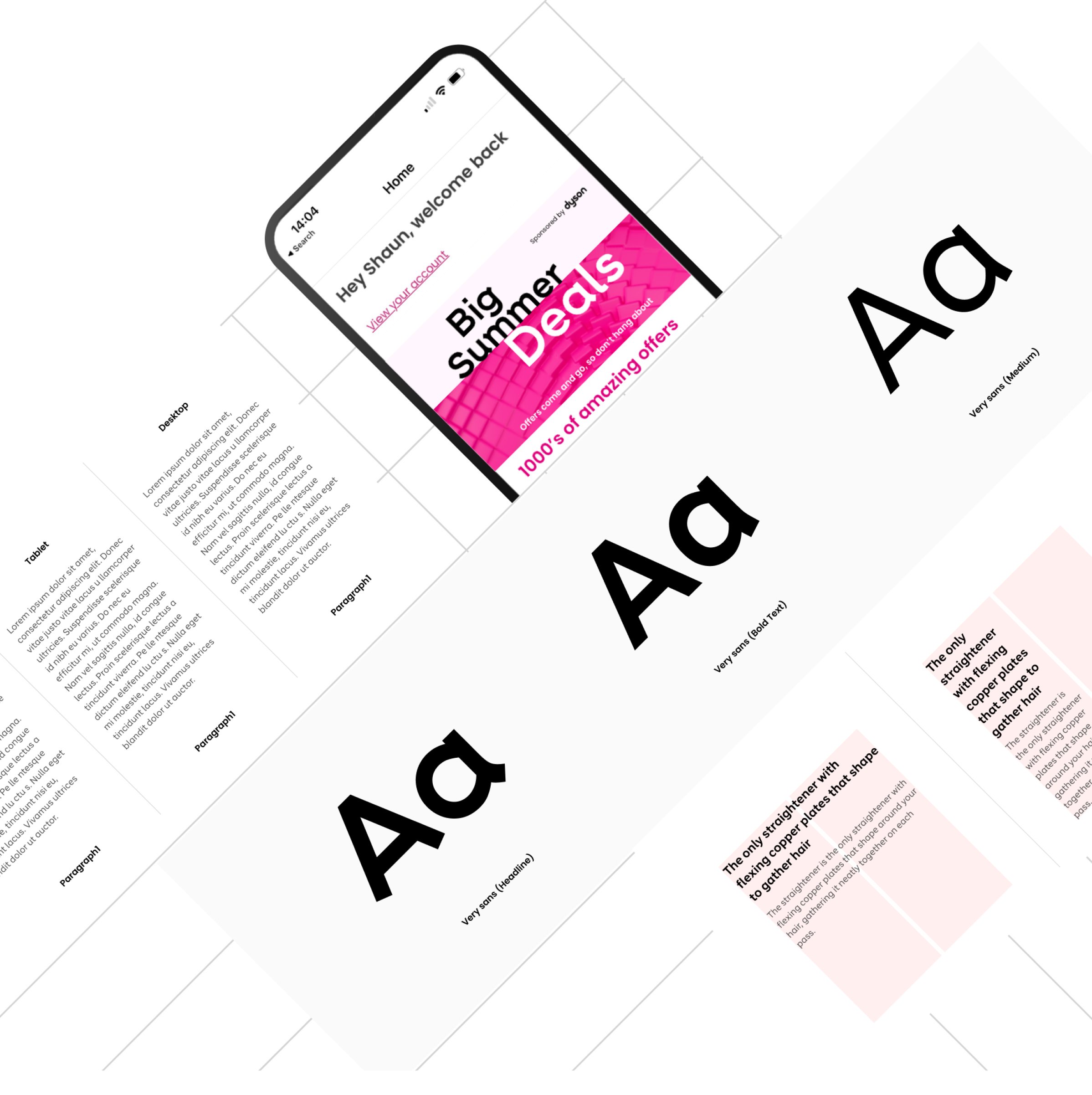
While various structures were explored, the team settled on an atomic design system taxonomy, composed of foundations, elements, components and patterns. Not unsurprisingly, the foundations module library provided the starting point, as the team sought to lock down color schemes, typography, a grid system, spacing and more.
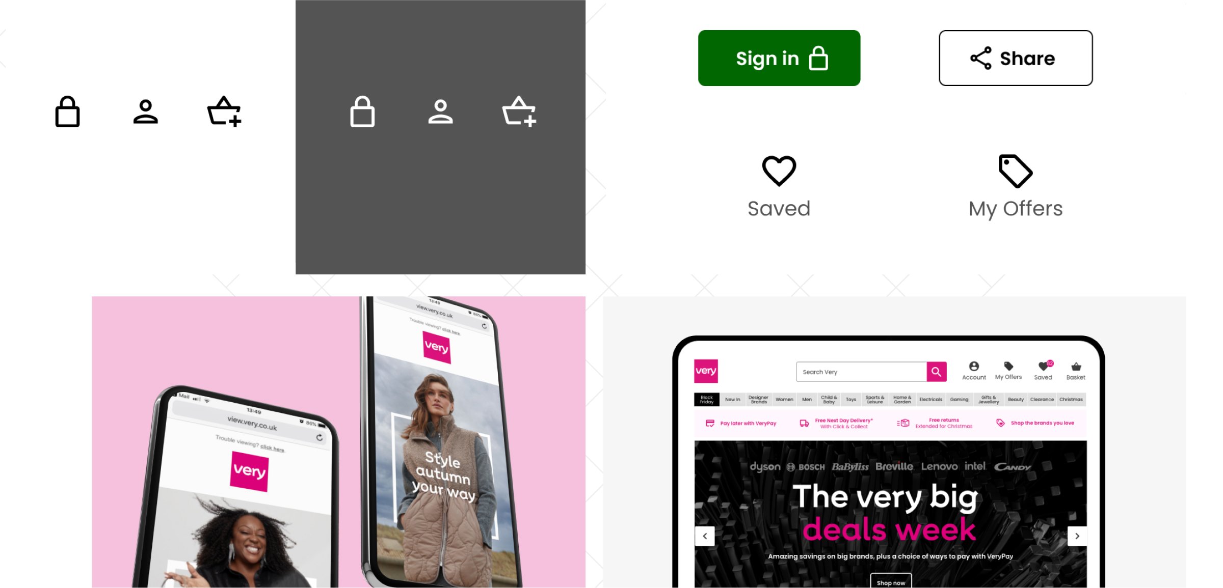
Core elements and components closely followed, quickly consigning TVG’s days of more than 50 different button styles to a thing of the past. A separate modules library just for the apps ensured the flexibility to surface native patterns and interactions. After just six months together, the team had built, tested and released more than 30 different design system modules, many of which were actively being used by squads who were migrating experiences to the new Skyscape platform.
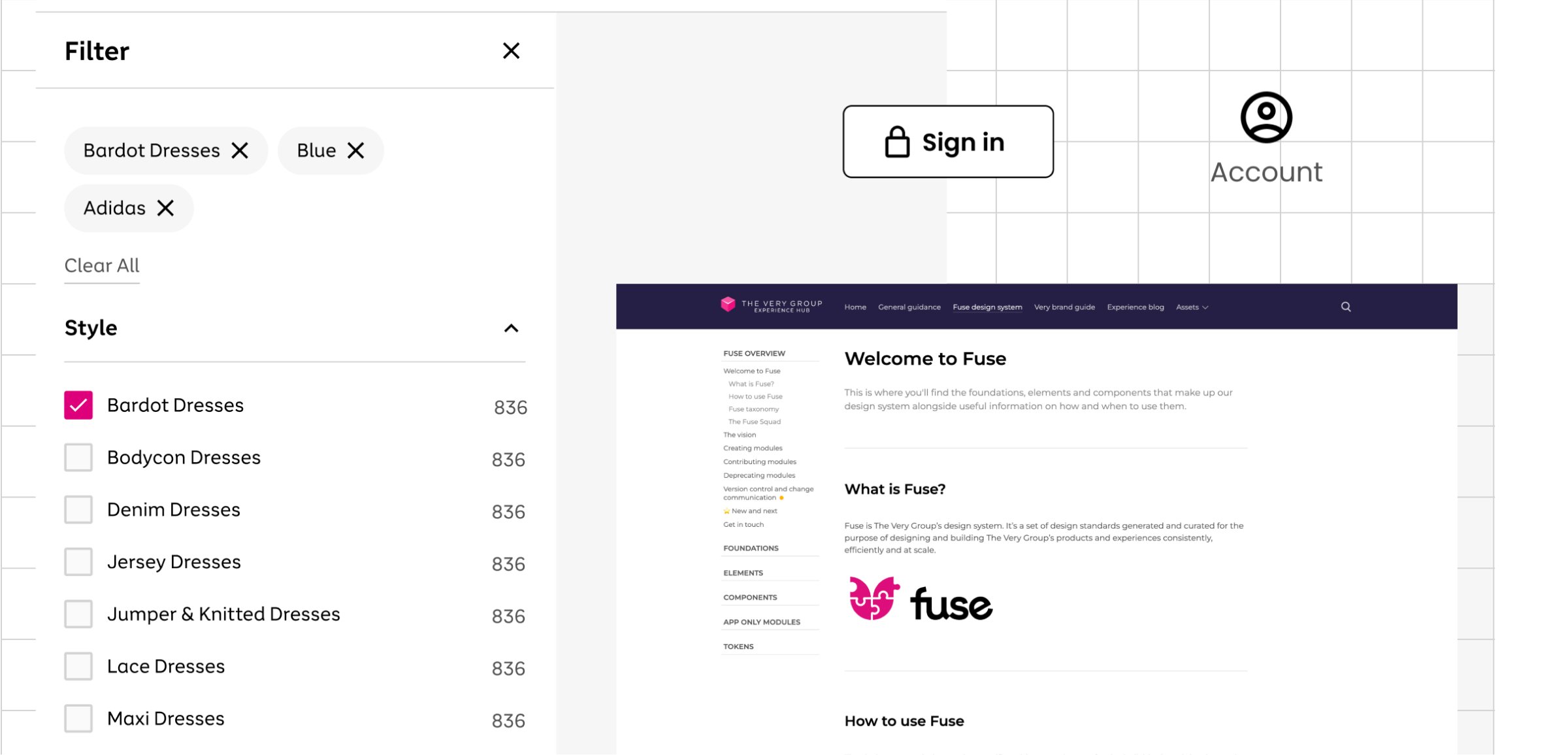
Users wanting to get their hands on the new modules were given three different points of entry to the system, each one specifically catering for different user needs. Designs for every module are stored in a Figma library, enabling designers to effortlessly incorporate the components into their own layouts. Working examples of each component can be viewed and configured in Storybook, which is ideal for developers wanting to give modules a test run before they add the code to their builds.
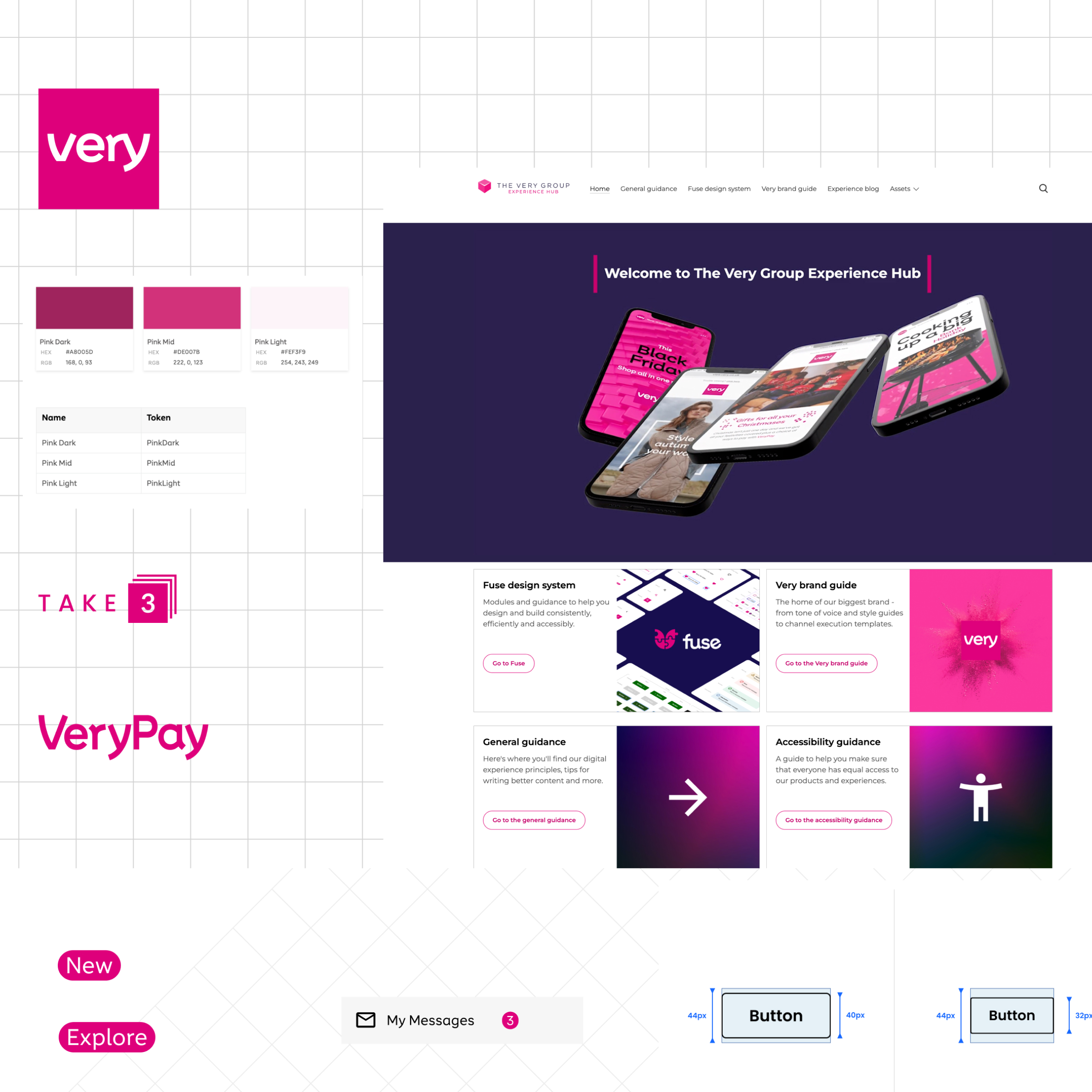
The team also used Frontify to build and launch an Experience Hub, which, among other things, contains detailed documentation, usage guidance and example images for every module. A dedicated content writer from Valtech helped to establish a consistent and inclusive approach to this documentation.
Tokenization helped enable fluid theming in Storybook, allowing users to quickly and easily pivot between the different brand executions, and future-proofing the design system against any future rebrands or new brands. Carefully curated modules, from typography scales and spacing increments to content banners and carousels, were exposed within the CMS to empower content teams without sacrificing wider consistency.
Governance models, built with and around users, and designed to standardize everything from contribution to communication, were established early on in the process and helped to grow and shape the design system, while frequent showcases to the wider organization helped to increase awareness and drive adoption.
Research and testing for continuous improvement
TVG already had a wealth of existing user research findings and experiment results to draw on, which helped to shape the requirements for specific modules, and to ensure the customer was always at the heart of the team’s decision making. The team also held regular interviews with internal users to help them understand what was working and which were the most important areas to improve.
As the design system matured, and more components became available to the product squads, those squads were able to use more of them in their research prototypes and feed any component-specific insight back into the design system.
Fully developed journeys were also able to be tested by Fable’s network of assistive technology users (Fable is an external research partner of TVG’s, specializing in accessibility), helping the team to quickly detect and fix any accessibility issues.

